About
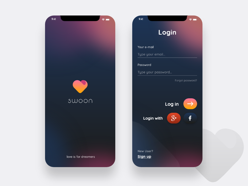
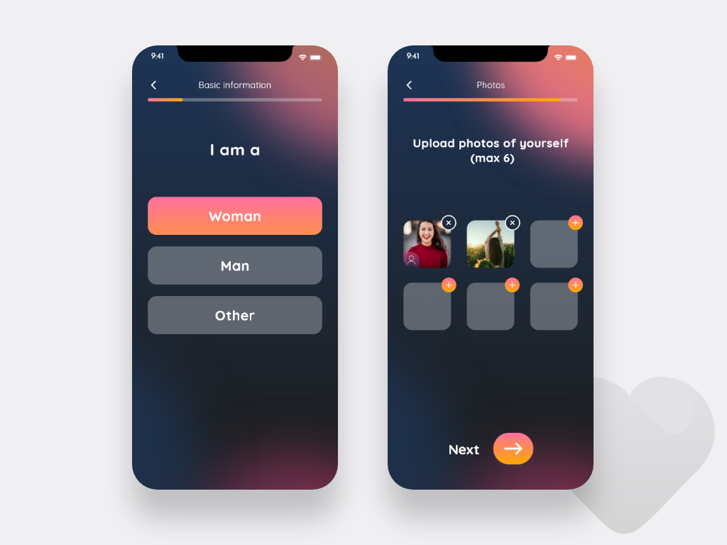
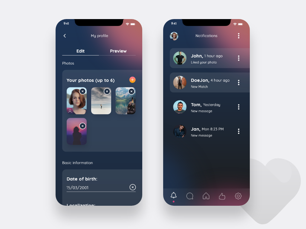
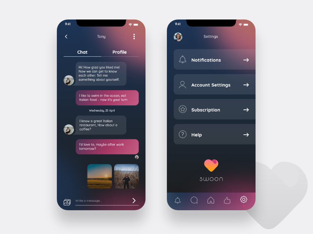
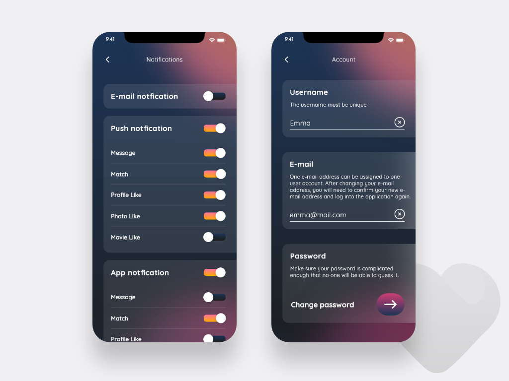
Swoon is a dating portal for which we prepared the UX and UI design. The UX project consisted of over 180 screens, while the full UI project is as many as 220 screens combined into a clickable prototype. The application is supposed to help users find their other half. A questionnaire filled in during account creation plays an important role in this process, with each user answering the same questions. The algorithm of the results works on the principle of matching - the more coinciding answers of the users, the more they match with each other. The app isn't available yet, so we can't divulge details.
Features:
- advanced user profile creation path ability to filter and search users,
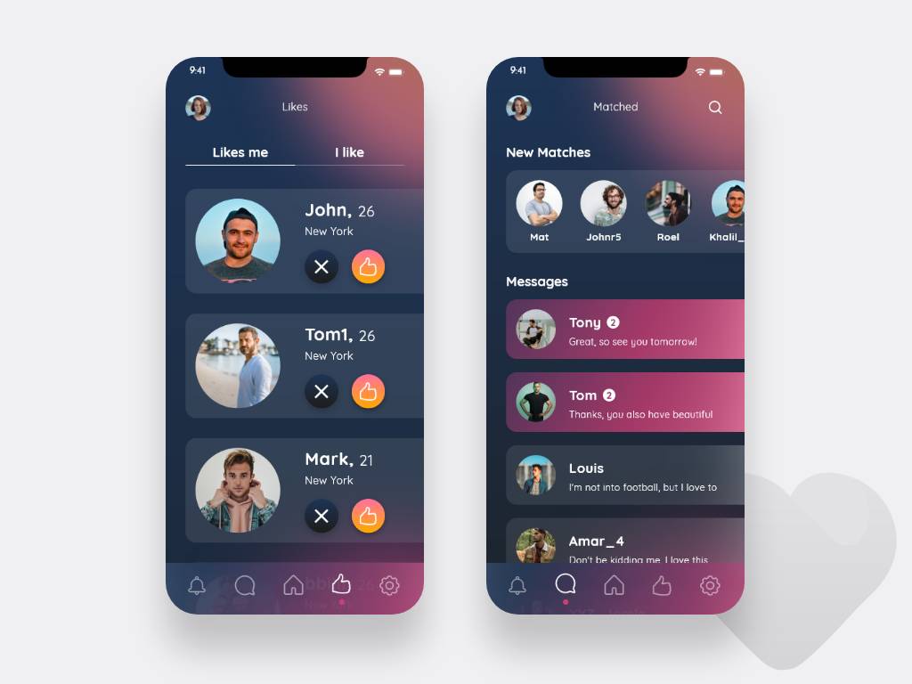
- matching radar - the application tells us with which user we have similar answers,
- chat,
- possibility to check who liked our profile subscription payment,


Goals
Problems
- Creating an intuitive dating app that stands out in terms of functionality and visuals from the existing ones.
Solutions
- Designing a clickable UX prototype - to catch as many errors as possible in the initial phase of the project and suggest better solutions.
- Creating a full design of the application along with branding.
- Conducting user tests to check the intuitiveness and to examine particular functionalities of the application.
Stages
Preparation
Before starting the design process, we conducted desk research and comparative analysis of the competition. We checked how the competitor's applications work - we tested them by identifying features that can distinguish Swoon from similar applications. In addition to the functional analysis, we examined the design trends so that the application is not only functional but also visually attractive.

Design
We started with the preparation of a UX - high-fidelity prototype, in which we proposed to the client the way the application works. It was also the moment when we evaluated the application's functionality - we solved the emerging problems and suggested new solutions. The next stage was the preparation of branding. We started with sketches of the logotype in different styles. Then, after the style was chosen by the client, we refined the Swoon logotype by choosing the right colors and typography. The next stage was to prepare a clickable UI prototype. During the design process, we conducted user research to catch any errors and polish the proposed solutions.

Implementation
Swoon
Swoon
Swoon
Swoon

Swoon
Swoon

Swoon
Swoon
Swoon
Swoon
Swoon
Swoon
Swoon
Swoon
Swoon
Swoon
Interested in projects from industry: Social Impact ?
Would you like us to come up with a proposal for your project? If so, just click on the "Get Project Estimate" button and we'll get back to you as soon as possible.
Get a quote


