


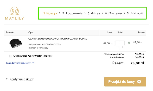
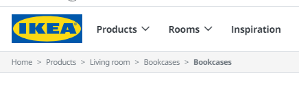
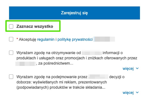
1. Show system status
Examples of such statuses could be breadcrumbs or the ordering stage in an online store. The main reason why we show the system status is to prevent the user from getting lost in the app or website. We don't want them to abandon a service or quit the shopping process by not knowing what is currently happening in the app or where they are and how to move on.
Steps of the purchase path
Breadcrumbs
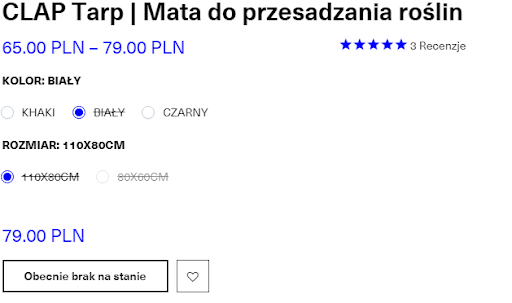
Availability of the good or service
Tags
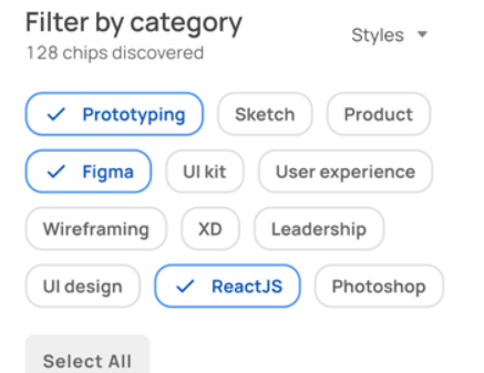
2. Maintain alignment between system and reality
When designing, always assume that the user has no idea what a smartphone or a web browser is. It is wise to search for schemes that can be associated with actual everyday objects. It is about iconography, the location of elements, the way they work.
Such an action will allow the user to get acquainted with the application more efficiently.
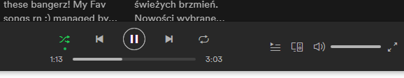
Example of a music player:
3. Give the user full control
An example of such control is the ability to undo, close, move on while informing the user of the moves being made. You need to predict what actions a potential app user could or would want to perform at each step. This prediction will allow you to design applications meeting the user's needs.
Examples:
- Navigation
- Or the ability to move to the appropriate steps
4. Stick to standards and maintain consistency (UI Design)
Consistency is divided into external and internal. Consistent design of the entire application or website will allow the user to understand its operation, functionality faster and easier, regardless of where they are in the process.
Internal consistency refers to:
- Fonts
- CTA button styling
- Colors and style of links
- Color palette within the site
- Positive and negative colors
- Button hover highlighting
- Display method
- Placement of form field descriptions
External consistency is about following generally accepted UX/UI standards:
- Menu on the top or side of the page
- Menu on devices (mobile/embedded) under the hamburger icon
- Shopping cart or notification icon in the upper right corner
- Menu icons - meaning
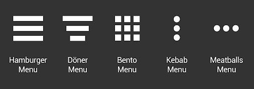
- Hamburger menu - Side pull-out menu, listing items, along with the ability to access sub-pages
- Doner menu - drop-down menu usually for filtering content on the page
- Bento menu - change to a grid menu of items
- Kebab menu - options for a subpage or selected item(s)
- Meatballs menu - more - hidden, additional options
5. Logo Placement
- WWW pages
Logo placement on the website is in the header, left side, or seldom in the middle. Very rarely, you can meet with the logotype on the right side. It is usually taken as a wrong design decision. The exception is designing websites for Arabic countries. The logotype on the left in the header is always identified with the possibility of a quick return to the home page. - Mobile applications
In mobile applications, the logotype is only a visual element that helps to build brand identity. It is placed in the header (left side or middle) if there is some space. The symbol/trademark itself is also often inserted. If it is not possible to put the logo in the header, it is hidden in the sidebar or in the "about us" section. - Web applications
The difference between a website and a web application is the structure. A web application usually has a navigation panel in the form of a sidebar or header, which allows you to use the functionality. In a web application, the logo is placed in the top left corner, no matter if it has a sidebar or not. - Potential mistakes:
- Logo too small
- Logo too large
- Non-distinctive logo
- Poor quality / blurry
- Material Design
- Human Interface Guidelines
6. That is why it is so important to be up to date with trends in a given group of product recipients. Users spend a lot of time on competitors' websites/product pages.
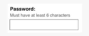
5. Prevent mistakes
You should help users not to make mistakes, like in the example below. It is also worth using clear explanations of inputs, intelligent hints, and tooltips. As in life, prevention is better than cure.
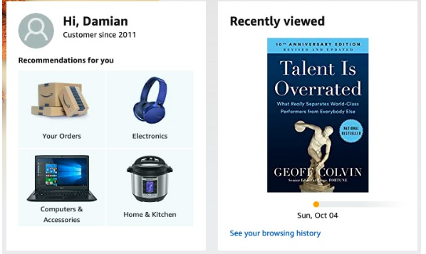
6. Show instead of forcing to memorize
A user, while browsing a website or an application, is not able to remember all its functionalities when there are a lot of them. Therefore, a good example is to give them "reminders'' such as "last viewed," "last visited," or "sort by last used." It also applies to inputs. It is a serious mistake to insert a destination inside the input, which disappears when you type anything. Here is an article about inputs from Nielsen Normal Group - Link.
- Input + description
This is an example of an ideal input, but it is not always possible due to small space on e.g. mobile devices.
- Last used
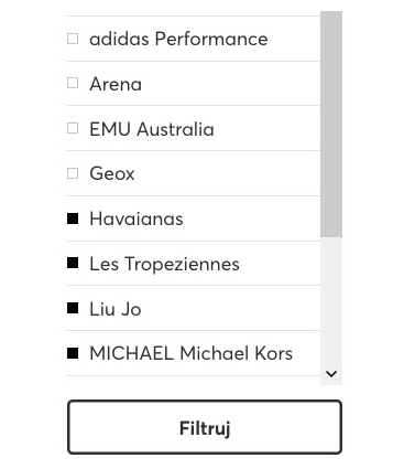
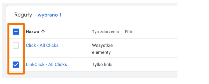
7. Flexibility and efficiency
In the places where the user needs to perform more actions, you should make it easier for them, e.g. by a toggle button to select everything or a checkbox to select a full column. Efficiency can also be increased by adding a "filter" button instead of immediately reloading the page after selecting a single attribute.
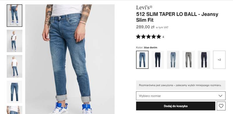
8. Take care of aesthetics and moderation
Less is more. Nowadays, users do not read, so in order to shorten the purchase process, for example, you should limit the number of visible elements on the page. It is worth focusing only on the most significant elements. It will allow you to design neatly and legibly, and the user will not get lost. In the example below - the section is divided into two parts: the gallery, which takes up 50% (the most important section for the user), and then the configuration containing the name, price, color, and size with the order button. In this way, the user is not distracted by additional page elements. (source: Zalando.pl)
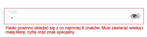
9. Provide effective error handling
When an error occurs, it is vital to explain to the user what the error is due to and the reason for the error. Take inputs, for instance. When we do not have input descriptions under the labels, we should provide the user with proper information about the error. An example could be a description of the password input error. For security reasons - errors at logging in should not indicate an invalid element, because it can facilitate the hacking of the account.
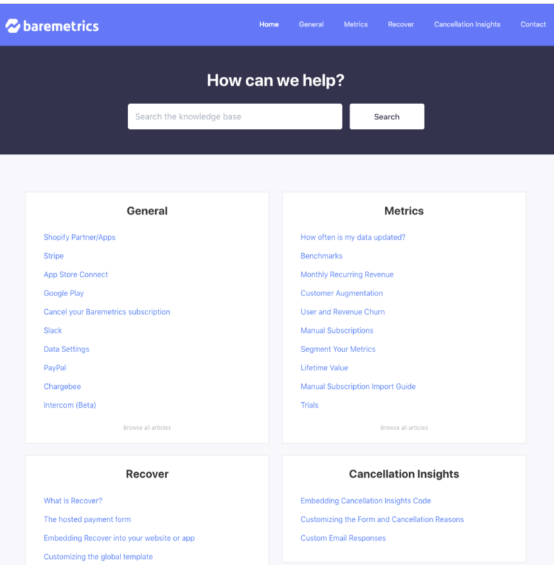
10. Take care of support and documentation
Regardless of the type of application, such documentation is required for a large project. When a user finds themselves in a situation where no hints will allow them to perform an action, use the application, they will look for help in the support, FAQ, or manual. On the other hand, if they do not find the answer, they may resign from using the application, and as a result, they won't come back to it. Below is a good example of clear support: